 While the potential of mobile information visualization is widely recognized, there is still relatively little research in this area and few practical guidelines for the design of mobile information visualization interfaces. Indeed, it would appear that there is still a general feeling in the interface design community that mobile visualization should be limited to simple operations on smaller datasets. Information visualization research has concentrated thus far on desktop PCs and larger displays while smaller mobile device interfaces have been neglected. This is in spite of their increasing popularity and widespread use. In this paper we address this issue by developing a set of low-level interface design guidelines for mobile information visualization development by considering a basic set of interactions and relating these to mobile device limitations. Our results suggests that the mindful application of existing information visualization techniques can overcome many mobile device limitations and that proper implementation of interaction mechanisms and view transitions are key to effective mobile information visualization.
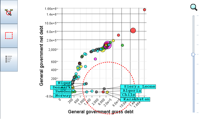
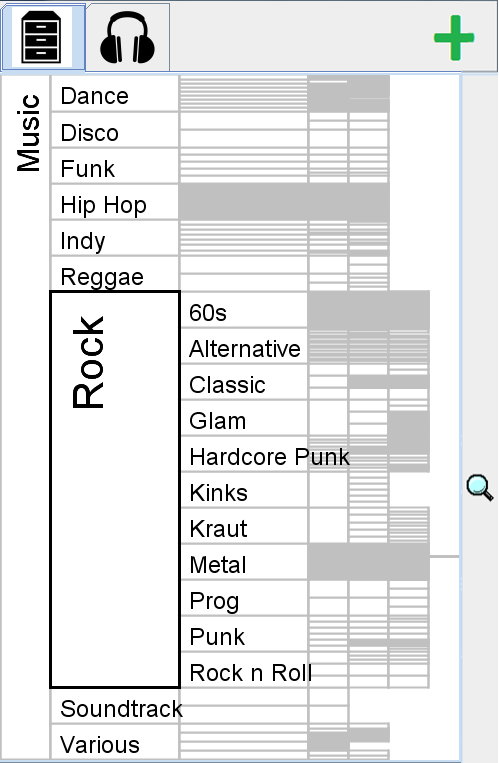
During our investigation of mobile visualisation we developed several prototypes including a coordinated map and timeline interface for geo-temporal data, a distorted scatterplot, and a space filling hierarchy view. This allowed us to prepare the following guidelines for mobile visualisation development,
 1) Be aware of the situations in which the application is likely to be used and adapt the interface accordingly for sporadic, hands-free or one handed use. Sporadic use means that the screen should efficiently communicate essential information and interaction should be short. Hands-free means that the user cannot directly interact with the device and one-handed interaction has the phone cradled in the right palm with tapping and dragging across a smaller area of the screen depending on the size of the users hand.
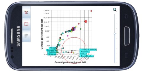
2) Use techniques that make more efficient use of available screen space or do not require accurate selections.. Techniques such as excentric labelling and space filling layouts fulfil this criteria. Interaction is less accurate on a mobile display so we shouldn’t rely on any degree of accuracy for the user to select objects.
3) Keep text and selection targets above a constant device-specific minimum size and scale other elements to fit these constraints. Text should be readable and the user should be able to make selections using appropriately sized selection targets.
 4) Don’t display too much information on the screen at the same time. Data should be aggregated or split over multiple screens to avoid saturation of the limited screen space. The user can interact with the interface to view more data over time with animation used to smooth the transition between views.
5) Use virtual buttons to switch between different types of selection. There is no natural equivalent to the differentiation between an mouse drag and a mouse hover on a touch screen so it is better to use virtual buttons and the toolbox metaphor to allow the user to user to choose between different types of selection. Virtual buttons can also be used as an equivalent for keyboard shortcuts.
6) Don’t allow important information to be hidden by the user’s finger during interaction. Information that is revealed by brushing should be positioned away from the point of contact or remain visible after the user releases their finger.
We applied these guidelines to the design of various case study applications. These applications use visualization techniques that can be applied with inaccurate touch-screen selection and, crucially, make the display more interactive to allow the user to view more of the data over time without saturating the limited display space. The additional cognitive load of having to interact more with the data and having less of the data shown at any one time is reduced by using animation to smooth the transition between successive views. These early results suggest that information visualization on mobile devices can be more capable than we previously imagined and that interaction and animation will be a key part of the implementation of effective information visualisation interfaces for more challenging data-sets and more demanding user requirements.
References
Craig, H. Chen, and F. Houssen, “A Task Based Evaluation of Fisheye Maps for Mobile Navigation,” presented at the 1st Conference on Emerging Topics in Interactive Systems, Suzhou, China, 2016.
Craig, P., Interactive animated mobile information visualisation, in SIGGRAPH Asia 2015 Mobile Graphics and Interactive Applications. 2015, ACM: Kobe, Japan. p. 1-6.
Craig, P. and X. Huang, The Mobile Tree Browser: A Space Filling Information Visualization for Browsing Labelled Hierarchies on Mobile Devices, in PICom 2015 : The 13th IEEE International Conference on Pervasive Intelligence and Computing. 2015: Liverpool.
Craig, P., et al., Pervasive Information Visualization: Toward an Information Visualization Design Methodology for Multi-device Co-located Synchronous Collaboration, in PICom 2015 : The 13th IEEE International Conference on Pervasive Intelligence and Computing. 2015: Liverpool.
Craig, P. and X. Huang, Animated Space-Filling Hierarchy Views for Security Risk Control and Visualization on Mobile Devices, in 2015 International Conference on Environmental Engineering and Applied Technology (EEAT 2015) 2015: Hohhot, China.