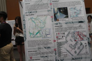
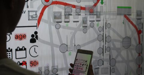
 This project developed an interface for visualizing visitor behaviour and movement within museum exhibitions. There is a long history of tracking visitors to museum exhibitions [1-3]. The information gathered from visitor tracking can be useful for revealing general patterns of visitor behaviour or allowing the exhibition organizers to uncover specific patterns that lead them to modify the layout of an exhibition. Traditionally the visualization of visitor behaviour is based on directed graph visualization techniques which use straight lines and suffer from the problem of crossing lines and clutter when larger amounts of visitor data are included [4] (see figure 1). The aim of this project was to investigate how techniques such as curved lines [4, 8] can be used to resolve these issues and help us to generate more elegant and readable visual representations of the data.
 The project employed a user-centred design methodology working closely with prospective users at the Museum of Nanjing (and within the XJTLU Supervisory Team) in order to develop usable and effective software.
The benefit of a more effective visualization [9] of visitor tracking results was to allow analysts to explore the data to develop a fuller and deeper understanding of how visitors, and different types of visitors, move around the exhibition. The general advantages of interactive information visualization are that it can help users gain insight into their data and reveal previously unsuspected patterns [10, 11]. This proved useful for the analysis exhibition visitor data analysis where patterns of user behavior can be unpredictable and effective analysis is an exploratory process that can depend on a different variables [1].
Results from the project contributed to AH/P009808/1 Producing/Consuming ‘Romantic Scotland’: Exhibitions, Heritage, Nation & the Chinese Market (XJTLU co-PI Yiwen Wang) and RDF-14-03-22 – Information-Visualization Interfaces for Multi-device Co-located Synchronous Collaboration. The project also won the XJTLU SURF Summer Studentship Prize.
References
[1] S. S. Yalowitz and K. Bronnenkant, “Timing and tracking: Unlocking visitor behavior,” Visitor Studies, vol. 12, pp. 47-64, 2009.
[2] E. S. Robinson, “The behavior of the museum visitor,” 1928.
[3] A. W. Melton, “Problems of installation in museums of art,” 1935.
[4] M. Graham and J. Kennedy, “Using curves to enhance parallel coordinate visualisations,” in Information Visualization, 2003. IV 2003. Proceedings. Seventh International Conference on, 2003, pp. 10-16.
[5] D. Holten and J. J. Van Wijk, “Force‐Directed Edge Bundling for Graph Visualization,” in Computer graphics forum, 2009, pp. 983-990.
[6] E. R. Gansner, Y. Hu, S. North, and C. Scheidegger, “Multilevel agglomerative edge bundling for visualizing large graphs,” in Pacific Visualization Symposium (PacificVis), 2011 IEEE, 2011, pp. 187-194.
[7] D. Holten, “Hierarchical edge bundles: Visualization of adjacency relations in hierarchical data,” IEEE Transactions on visualization and computer graphics, vol. 12, pp. 741-748, 2006.
[8] P. Craig and J. Kennedy, “Concept Relationship Editor: A visual interface to support the assertion of synonymy relationships between taxonomic classifications,” in Electronic Imaging 2008, 2008, pp. 680906-680906-12.
[9] C. Perin, “Direct Manipulation for Information Visualization,” Paris 11, 2014.
[10] P. Saraiya, C. North, and K. Duca, “An Evaluation of Microarray Visualization Tools for Biological Insight,” in IEEE Symposium on Information Visualization (INFOVIS’04), Austin Texas, 2004, pp. 1-8.
[11] B. Shneiderman, “Inventing Discovery Tools: Combining Information Visualization with Data Mining,” Information Visualization, vol. 1, pp. 5-12, March 2002.
